TEAM
TEAM


ROLE
ROLE
0 -> 1 Concept
0 -> 1 Concept
Design System
Design System
UX Research
UX Research
Product Launch
Product Launch
DURATION
DURATION
May' 24 - Apr' 25
As a contractor, I worked at Moon Surgical as the only Product Designer (AI) to support them in their digital transformation and be ready for the future.
I created the Maestro Insights Platform based on business requirements and crafted it into an end-to-end, currently live AI based dashboard that helps surgeon adopt and become an expert in using robots to conduct surgeries, drastically reducing fatigue, saving costs and making resources available.
Preview of the Maestro Insights Platform
Preview of the Maestro Insights Platform
Project Overview
CONTEXT
CONTEXT
The Maestro robotic system integrates seamlessly into any existing Operating Room setup.
The Maestro robotic system integrates seamlessly into any existing Operating Room setup.
The robot collects data through sensors and cameras during procedures. This data powers real-time decision-making and post-surgery reflection, enabling a continuous loop of learning and improvement for surgeons and their teams.
The robot collects data through sensors and cameras during procedures. This data powers real-time decision-making and post-surgery reflection, enabling a continuous loop of learning and improvement for surgeons and their teams.

This case study features end-to-end design of the Maestro Insights Platform — the post-surgical reflection tool for surgeons.
This case study features end-to-end design of the Maestro Insights Platform — the post-surgical reflection tool for surgeons.
Project Features
FEATURES OF MAESTRO INSIGHTS
FEATURES OF MAESTRO INSIGHTS
Trend Cards
Trend Cards
Trend Cards are located on the dashboard page for surgeons. It helps surgeons make sense of critical KPIs at a glance.
Trend Cards are located on the dashboard page for surgeons. It helps surgeons make sense of critical KPIs at a glance.
“If something shifted, I’d like to know up front, just the key signals.”
“If something shifted, I’d like to know up front, just the key signals.”
View Design Exploration
Surgeon Dashboard with Trend Cards
Surgeon Dashboard with Trend Cards
View Design Exploration
Distribution Chart
Distribution Chart
Also on surgeon dashboard, distribution charts help surgeons track their procedure targets over time, in an interactive way.
Also on surgeon dashboard, distribution charts help surgeons track their procedure targets over time, in an interactive way.
“If I can see how I’ve used the robot over time, I can better understand the value it’s adding”
“If I can see how I’ve used the robot over time, I can better understand the value it’s adding.”
View Design Exploration
Surgeon Dashboard with Distribution Chart
Surgeon Dashboard with Distribution Chart
View Design Exploration
Recent Cases
Recent Cases
Recent cases allow a surgeon to keep track of their latest cases and track their case time, notes, as well as detailed AI analysis.
Recent cases allow a surgeon to keep track of their latest cases and track their case time, notes, as well as detailed AI analysis.
“I like to check what I did recently, my cases, timing, and if anything needs my attention?”
“I like to check what I did recently, my cases, timing, and if anything needs my attention?”
View Design Exploration
Surgeon Dashboard with Recent Cases
Surgeon Dashboard with Recent Cases
View Design Exploration
Clicking a Recent Case opens up a detailed AI Synopsis Modal
Clicking a Recent Case opens up a detailed AI Synopsis Modal
Surgeons can get a detailed analysis of their case performed through Maestro robot and take actionable insights
Surgeons can get a detailed analysis of their case performed through Maestro robot and take actionable insights
Surgeon Dashboard with Recent Cases
Surgeon Dashboard with Recent Cases
COMPONENTS OF RECENT CASES
Case Intelligence uses LLM to provide case summary
Case Intelligence uses LLM to provide case summary

Coupled with numbers, recent cases provide a holistic picture
Coupled with numbers, recent cases provide a holistic picture

Surgeons see details of the instruments they used with the robot, learn actionable insights
Surgeons see details of the instruments they used with the robot, learn actionable insights

For note taking, just say "Hey Maestro", and continue speaking. AI steps in.
For note taking,
just say "Hey Maestro", and continue speaking. AI steps in.

FOR HOSPITAL ADMINISTRATORS
FOR HOSPITAL ADMINISTRATORS
Admin Dashboard
Admin Dashboard
Hospital administrators can track a site's robot performance in the form of metrics such as Top Service Lines, Surgeons, and live robot status.
Hospital administrators can track a site's robot performance in the form of metrics such as Top Service Lines, Surgeons, and live robot status.
“I would like to see how the robot is used in order to justify the return on investment”
“I would like to see how the robot is used in order to justify the return on investment”
View Design Exploration
Administrator Dashboard with KPIs
Administrator Dashboard with KPIs
View Design Exploration
OR Traffic Control
OR Traffic Control
This space serves as the live robot status and schedule for the administrators to track. They can even track robotic cases in real time.
This space serves as the live robot status and schedule for the administrators to track. They can even track robotic cases in real time.
“I would need a clear picture of how Maestro is used throughout the day.”
“I would need a clear picture of how Maestro is used throughout the day.”
View Design Exploration
Administrator OR TRaffic Control with Live Case
Administrator OR TRaffic Control with Live Case
View Design Exploration
Clicking a scheduled case opens up a Live Case modal
Clicking a scheduled case opens up a Live Case modal
Administrators can get a closer look on the events that took place during the case.
Administrators can get a closer look on the events that took place during the case.
Admin Traffic Control with Live Case modal
Admin Traffic Control with Live Case modal
Problem and Process
USER NEEDS AND PRODUCT CONCEPTUALIZATION
USER NEEDS AND PRODUCT CONCEPTUALIZATION
The Maestro system is a compact robot, which helps surgeons perform minimally invasive surgeries with precision
The Maestro system is a compact robot, which helps surgeons perform minimally invasive surgeries with precision.

However, Surgeons are not able to track its impact
However, Surgeons are not able to track its impact
The system is built to create feedback loops: capturing data and reflecting it back to users. But, the way it presents insights isn’t intuitive or actionable.
The system is built to create feedback loops: capturing data and reflecting it back to users. But, the way it presents insights isn’t intuitive or actionable.

To solve this, we wanted to understand what's important for the surgeons
To solve this, we wanted to understand what's important for the surgeons

We did this by collecting data through 3 methods.
We did this by collecting data through 3 methods.
The data collection helped us pinpoint two distinct users (Surgeons, and Hospital Administrators), with overlapping needs.
The data collection helped us pinpoint two distinct users (Surgeons, and Hospital Administrators), with overlapping needs.

During brainstorming for solutions, we ideated three distinct concepts: Email templates, PDF reports, or an interactive dashboard
During brainstorming for solutions, we ideated three distinct concepts: Email templates, PDF reports, or an interactive dashboard


However, after interviewing users, analyzing competition and realizing the dynamic KPI requirements, we locked in on an interactive dashboard.
However, after interviewing users, analyzing competition and realizing the dynamic KPI requirements, we locked in on an interactive dashboard.

We aligned with the team to prioritize the KPIs that are feasible, impactful, and worth building for users
We aligned with the team to prioritize the KPIs that are feasible, impactful, and worth building for users

This alignment lead to the conceptualization of the Dashboard.
This alignment lead to the conceptualization of the Dashboard.

After brainstorming design ideas, I created an outline of the system architecture for the Dashboard
After brainstorming design ideas, I created an outline of the system architecture for the Dashboard

This was followed by creating wireframes to test them with our trusted partners
This was followed by creating wireframes to test them with our trusted partners

After concept validation, we needed a high fidelity lift to test further and move forward
After concept validation, we needed a high fidelity lift to test further and move forward

Once the mockups were ready, this is what they looked like
Once the mockups were ready, this is what they looked like

For refinement, I interviewed 11 surgeons and had them give us a score across 3 categories
For refinement, I interviewed 11 surgeons and had them give us a score across 3 categories

“This feels more like something for data enthusiasts. I don’t see myself using it regularly.”
“This feels more like something for data enthusiasts. I don’t see myself using it regularly.”
“I don’t have time to scan graphs or numbers, just tell me what I need to know.”
“I don’t have time to scan graphs or numbers, just tell me what I need to know.”
“Looks better than MyIntuitive for sure, but it’s the same kind of data - and I don’t really use that either.”
“Looks better than MyIntuitive for sure, but it’s the same kind of data - and I don’t really use that either.”
It was clear from the results that surgeons needed something more than just data, they needed insights
It was clear from the results that surgeons needed something more than just data, they needed insights

I presented the findings to our stakeholders, which helped us pivot to an AI focused insights platform
I presented the findings to our stakeholders, which helped us pivot to an AI focused insights platform
Our realignment introduced LLM based insights and a vibrant design system
Our realignment introduced LLM based insights and a vibrant design system

This move led to the creation of Phase 1.0 of Maestro Insights
This move led to the creation of Phase 1.0 of Maestro Insights

IMPACT
We launched the product in Dec'24 and gauged the impact until Mar'25
We launched the product in Dec'24 and gauged the impact until Mar'25


HERE ARE MY TAKEAWAYS
Product Development is rarely linear.
Product Development is rarely linear.
Research helped me re-question assumptions and reframe success around real-world value.
Research helped me re-question assumptions and reframe success around real-world value.
Real-world testing shaped real-world priorities.
Real-world testing shaped real-world priorities.
Contextual testing helped us prioritize what truly mattered in the OR.
Contextual testing helped us prioritize what truly mattered in the OR.
Adoption is emotional, not just functional.
Adoption is emotional, not just functional.
I learned that trust is earned when tools feel intuitive, not imposed.
I learned that trust is earned when tools feel intuitive, not imposed.
Fanclash
Fixing the Team Creation Funnel to Improve Tournament Participation
90 Day Design Sprint
Worked with PM, Data Scientist, and Creative Lead
Listen as podcast
0:00/1:34
UX Research
Prototyping
Usability Testing
A/B Testing
Mobile Design
Introduction
FanClash lets users build fantasy esports teams and compete for rewards
Select five real players
Enter fantasy tournament
Earn points based on real-time player performance.
Problem
Participation dropped significantly after the first tournament

Users eagerly joined their first onboarding tournament using promo coins, but engagement sharply declined in subsequent contests, when users had to pay.
Situation
Returning users began the tournament funnel but abandoned the process before payment

Investigation
Something in the team creation step was confusing the users

Data showed that 87% of users reached the ‘Create Team’ page, but only 19% moved forward to payment—a massive drop.
Complication
Heat Map Analysis
Task Analysis
User behavior revealed hesitation, confusion, and abandoned interactions


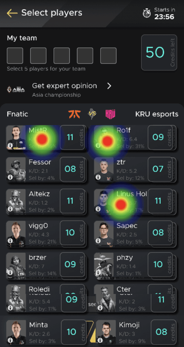

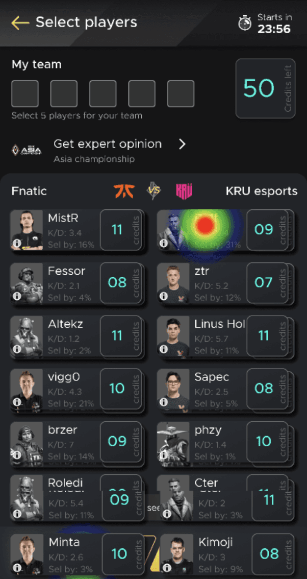

Through recorded sessions and usability tests, we observed:
Users repeatedly tapping on disabled player options
Uncertainty in selecting the required five players
Some users quitting the app entirely at this step

Narrowing the Problem
Follow up interviews revealed that the game rule was unclear, causing frustration

Users are only allowed to select maximum of 3 players from one team. However, users kept tapping the 4th player after selecting the 3rd player in the same team, with no noticeable visual feedback - leading to confusion.
Resolution
Learning from interviews, I not only simplified the player selection process, but also revamped the entire design system with better typography, colors, and visibility.

Exploration
To achieve this, I explored multiple mockups with improved layouts

Re-branded design system led to consistent colors and improved contrast

Bringing "My Team" section closer to the CTA for improved context

60-30-10 rule of color to improve visual scanning and pop-out critical information

Explored single column view, assuming that it could reduce cognitive load
Usability Testing
Selective usability testing helped us narrow down to one design
Reduced load on eyes due to balanced contrast and visual hierarchy. Less distracting CTA. Reduced scroll depth.
A/B Testing
I tested new design with wider audience using A/B Testing
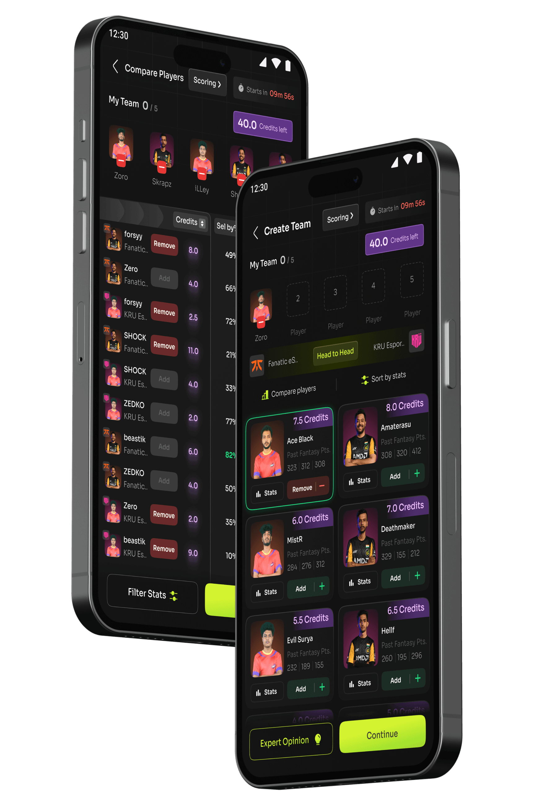
Variant A
Variant B
Results
We used Clevertap to track and test the worklfows
Users completing the entire Create Team funnel

✦ Users paying through the Create Team funnel increased from 56% to 67%
Impact
11% increase in Payment flow is a big achievement in a Pay to Play model

Change in conversion rate from Create Team to Pay & Confirm
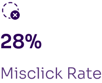
Other Notable Improvements
Team Completion Rate
+21%
Engagement with 'Expert Opinion' feature
+19%
Engagement with 'Player Stats' page
+28%
Takeaway
Data should inspire designs decisions.
If you have metrics, it really helps to compare enhancements in numbers, it works as a standardized goal for the entire team to achieve a quantified improvement.
Mixed - research methods give fascinating results.
Analytics revealed the drop in numbers, but interviews and engagement analysis revealed the actual behavior.