Maestro Insights Platform
Maestro is a robotic surgical system designed to assist surgeons in performing minimally invasive procedures with enhanced precision and control. The Maestro Dashboard will complement the robot by providing users with an intuitive interface to analyze their performance, track key surgical metrics, and plan improvements, ensuring optimized efficiency and data-driven decision-making in their practice.
Quick Read
Estimated Time: 8 minutes

Conceptualizing a web portal
The idea was to talk to hospital administrators, surgeons, and nursing staff to discover key insights as KPIs that they focus on for a successful surgery
Discovery Phase
Goals
The journey began with a simple question: How can we transform the chaos of surgical data into a seamless, intuitive experience?
Our mission was clear—develop a dashboard that meets the needs of both surgeons and hospital administrators, providing actionable insights to improve surgical efficiency. To do this, we needed to dive deep into their world and uncover what metrics mattered most, where the pain points were, and how technology could help bridge the gaps.


Methodologies
Armed with this mission, we set out to conduct a series of in-depth interviews. We sat down with surgeons and administrators from key healthcare facilities, carefully gathering their experiences, frustrations, and aspirations. Through these conversations, we uncovered insights into the metrics they tracked, the pain points they faced, and their needs for a more efficient data solution.
We didn’t just stop there. To ensure our dashboard would outshine the competition, we also studied some of the leading apps in the field. By analyzing platforms like MyIntuitive and VersiusConnect, we observed how they tackled similar challenges. This competitive benchmarking helped us extract valuable lessons on user experience, data visualization, and key features that could be incorporated into our solution.
Findings
The insights were enlightening.
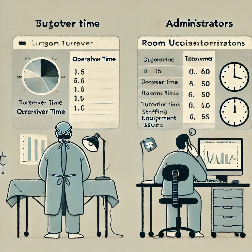
Surgeons prioritized metrics like turnover time, operative time, and patient outcomes. Their frustration stemmed from a lack of detailed, accessible data to evaluate their efficiency and the hurdles they faced when adopting new technologies.
For administrators, the focus was on operational efficiency—metrics such as room utilization and turnover times were top of mind. However, they were also grappling with challenges like staffing shortages, inconsistent data across systems, and the reliability of equipment.
Conceptualization
Building on the insights from the discovery phase, we began brainstorming and sketching initial concepts that addressed the identified pain points and leveraged the strengths found in competitor platforms. These early sketches were guided by user needs, business goals, and the insights gathered from interviews and competitor analysis. Through multiple iterations, internal reviews, and alignment with strategic objectives, these ideas evolved into low- and mid-fidelity wireframes, forming the foundation for the final dashboard design.

Evolution of Concepts
The sketches evolved into wireframes, this resulted in better organization of information and a space to add comments by team members

Brainstorming
The sketches involved a lot of brainstorming and questions along the way

Concept Validation
Based on the unique needs and complexity of both user groups, we decided to treat the surgeon and admin projects as distinct components, while eventually integrating them into a unified dashboard.
As the project is ongoing, our business goals have led us to prioritize the admin component.
Testing with Hospital Administrators
Through the concept validation interviews, we uncovered several distinct user groups (personas) among hospital administrators. These personas, each with unique roles, needs, and goals, play a critical part in managing surgical services. For the MVP, we prioritized creating a simple dashboard that remains agnostic but effectively caters to the needs of all these user personas:
Chief Medical Officer (CMO)
Chief Operating Officer (COO)
Chairman of Surgery
Vice President of Surgical Services
Chief Nursing Officer (CNO)
Medical Director
Nursing Service Line Leader

Findings
1. Trends & Metrics
Key Insights: Users valued trends for total cases, monthly cases, and top procedures, but requested additional information such as cost data tied to inventory usage, and distinguishing between emergent and elective cases.
Actionable Suggestions:
Add total cases for each procedure.
Display cost-related trends, especially for consumables.
Include surgeon-specific performance tracking.
Introduce projections and year-over-year comparisons to account for seasonal trends.
2. Dashboard Usability
Key Insights: The top procedures and surgeons' charts were well-received, but users needed drill-down features and the ability to compare data over time.
Actionable Suggestions:
Include a drill-down function for service line and procedure-specific data.
Compare surgeon performance with previous months/years.
Show projections for future performance trends.
Combine inventory usage with cost data to track expenses by surgeon.
3. Utilization Metrics
Key Insights: Utilization metrics were essential, particularly for identifying patterns based on prime and non-prime hours, days of the week, and block time usage.
Actionable Suggestions:
Customize prime and non-prime time definitions.
Add surgeon block time and allow comparison of actual usage.
Compare case count with previous periods and provide future projections.
4. Efficiency Tracking
Key Insights: Intraoperative time and surgeon comparison were valuable, but users wanted more granular data, such as breakdowns of specific surgical phases (e.g., setup, operative, turnover time).
Actionable Suggestions:
Break down operative time into specific phases.
Focus on outliers for easier analysis.
Use quadrant graphs to compare surgeon performance based on speed, complications, and case complexity.
5. Inventory Management
Key Insights: Users appreciated the ability to track consumables and system information, but needed more real-time data and comparisons between consumed vs. projected usage.
Actionable Suggestions:
Add trends comparing actual vs. projected consumable usage.
Display real-time system maintenance data, such as service visits and equipment status.
6. Customization and My Insights Page
Key Insights: The ability to customize and generate reports, especially for tracking surgeon performance and comparing data, was highly valued.
Actionable Suggestions:
Allow users to drill down into surgeon-specific data on the My Insights page.
Provide customization options for generating reports and exporting data in various formats (PDF, raw data, etc.).


Research Conclusion
With these insights, the dashboard evolved into key sections: the homepage, which summarizes trends and key metrics, utilization metrics for tracking OR efficiency, efficiency metrics to analyze surgical performance, inventory management, and the customizable My Insights page for deeper data exploration.
This structure ensures the dashboard meets the varied needs of administrators while providing clear, actionable insights.
High - Fidelity Prototyping (In - Progress)
After gathering insights from the concept validation, we moved into high-fidelity prototyping. This phase focused on refining the design based on user feedback, ensuring the dashboard was visually clear, intuitive, and functional. Key areas like the homepage, utilization metrics, efficiency tracking, and the customizable My Insights page were developed to meet the users' needs.

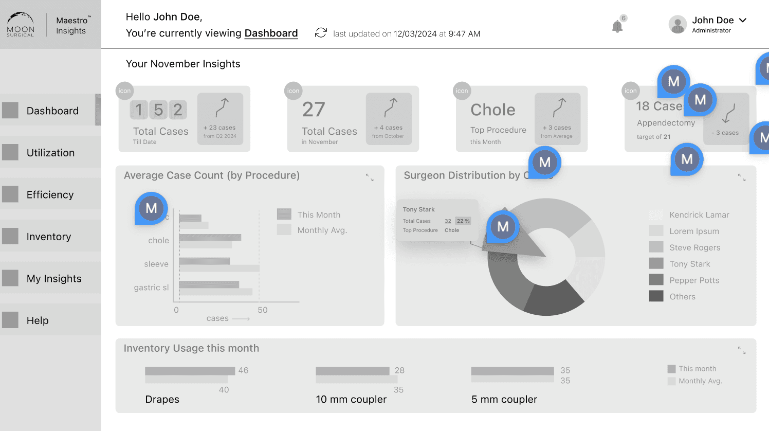
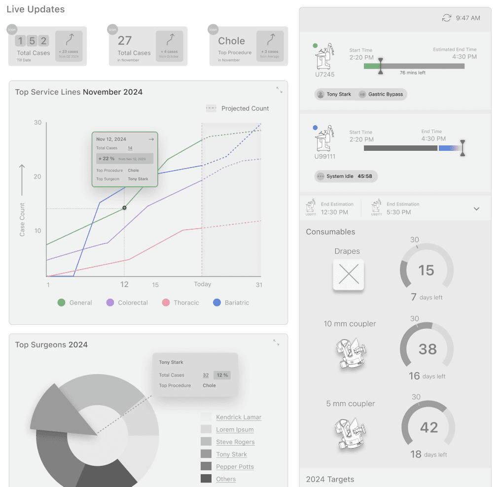
Dashboard - Home
Provides an overview of key metrics, trends, and performance indicators for surgical services at a glance.


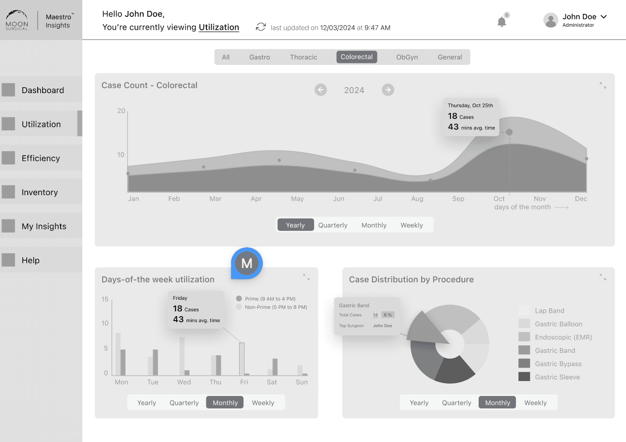
Utilization
Tracks operating room usage, prime/non-prime hours, and block time allocation for efficient scheduling and resource management.
Efficiency
Displays detailed metrics on surgical performance, including intraoperative times, surgeon comparisons, and case complexity.


Inventory
Monitors consumable usage, system maintenance, and real-time tracking of supplies to optimize resource allocation.
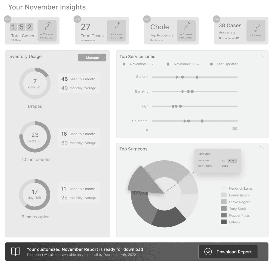
My Insights
A customizable page that allows users to generate reports, compare surgeon performance, and dive deeper into specific data trends.
Next Steps
The project’s future direction will focus on refining, testing, and continuously iterating the dashboard to ensure it meets user needs and aligns with business goals.

Prototype Refinement and Internal Testing
Refine the prototype interactions and conduct internal testing with the product and marketing teams to align with business goals and establish a Minimum Viable Product (MVP).

Usability Testing and Feedback Gathering
Test the prototype with real users using the Maze platform, gather sufficient feedback, and decide if further interviews are needed before moving to prototype refinements and A/B testing.

MVP Development and Iterative Release
Once feedback is incorporated, the MVP will be ready for development and deployment. Continuous monitoring of feedback and usage patterns will drive iterative updates, leading to a mobile app release for Maestro robot usage by hospitals across the US and EU.
Thank You.