

ROLE
DURATION
Jul' 24 - Sep' 24
CONTEXT
This case study features the redesign of the HMI to optimize robot control by surgical teams
WHY WAS A REDESIGN NEEDED?
Excessive touch targets in a linear flow
Users expected to follow a linear, three step journey to complete the robot setup, but the interface showed too many touch targets in a disorganized, often close packed fashion, causing cognitive fatigue, hesitation, and errors.
Touch Targets

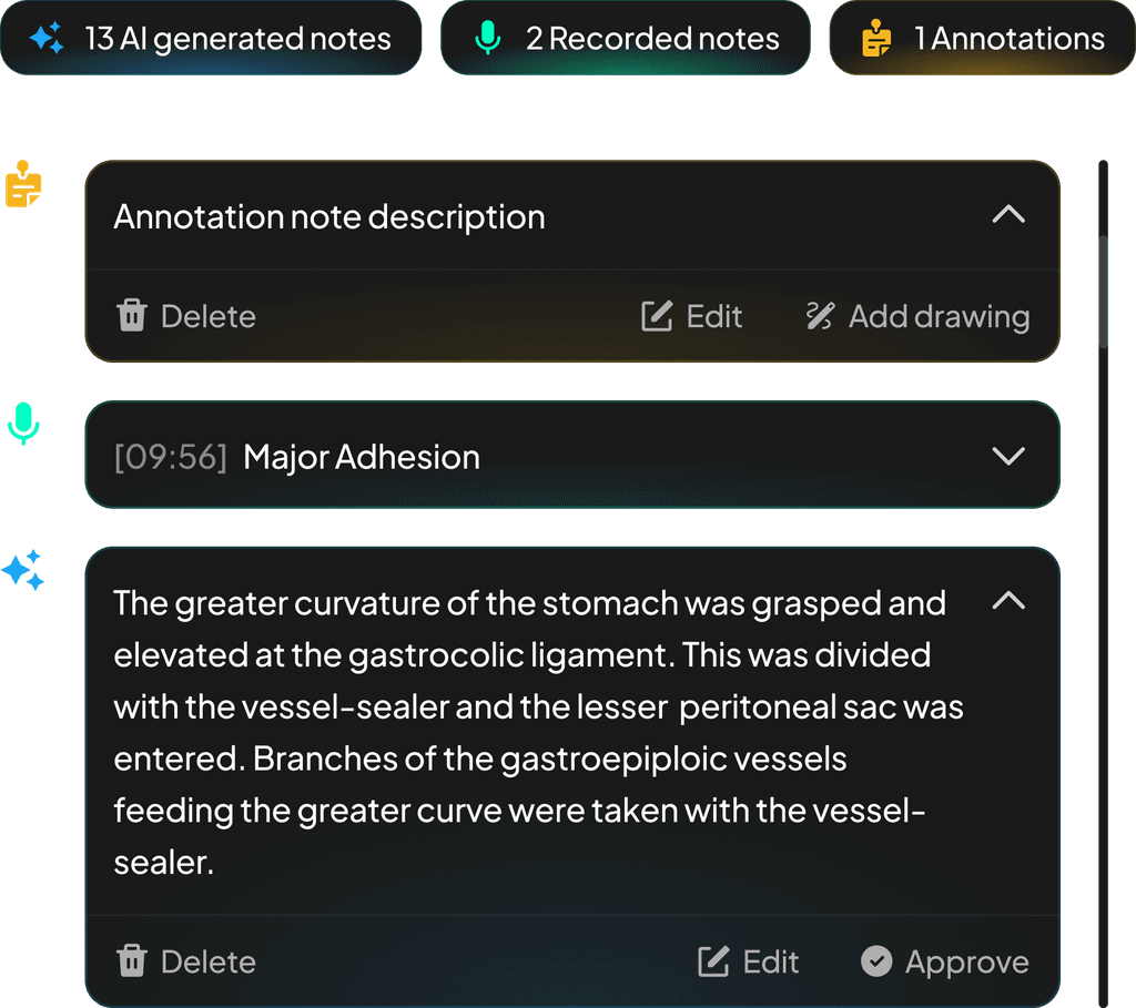
Unclear Instructions
Guided instructions for setup lacked visual hierarchy and clarity, leaving users unsure of what to do next - leading to backtracking, and time consuming setup.
Instructions

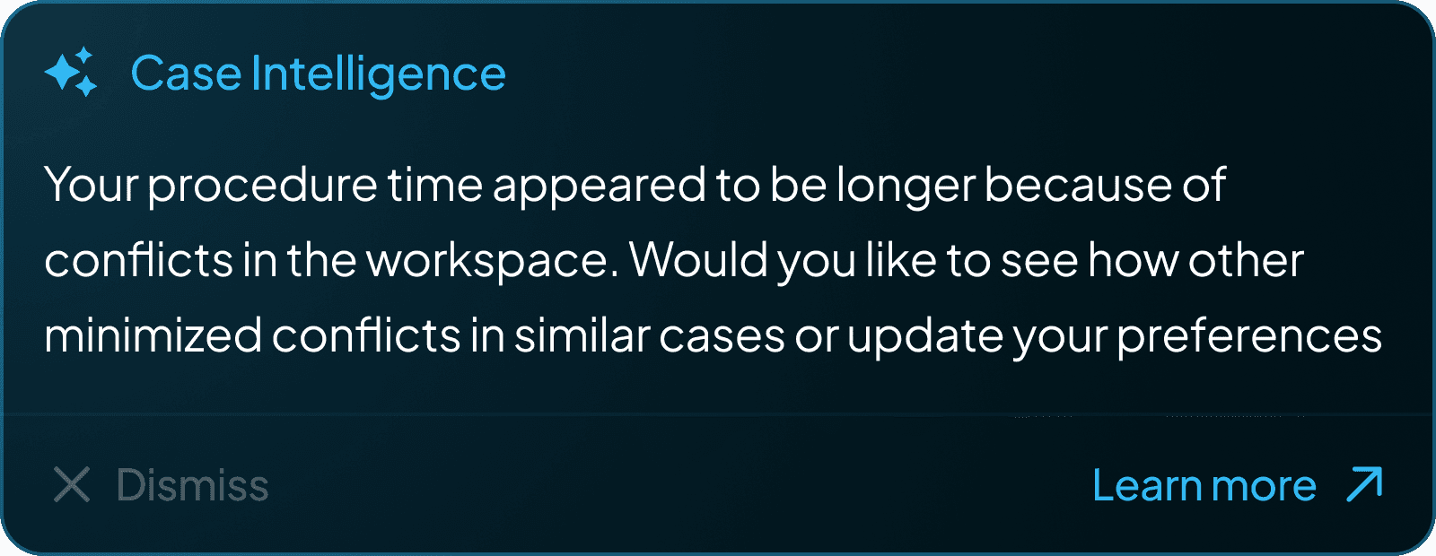
Fault modals with no context
When a fault occurs, modals appear without contextual fault message or recovery option, often blocking the entire interface - forcing users to restart the system - breaking trust and disrupting critical workflows.
Faults

Emphasis on icons
The new design system focused more on icon based targets, avoiding excessive use of text. This helped in maintaining clear visual hierarchy, balance, white space, and linear understanding.
Prioritize Fault Handling
Key changes were to display faults with clear labels and contextual visuals, so that surgical teams can understand what went wrong and recover without having to restart the system.
Movement Guidance
Our goal was to meet where users expect. That is to follow a simple, linear flow and provide guidance where it's necessary, without overwhelming them with instructions.
Select
Select
Select
Label
Label
Slide Button
ON
Off
ON


HERE ARE MY TAKEAWAYS
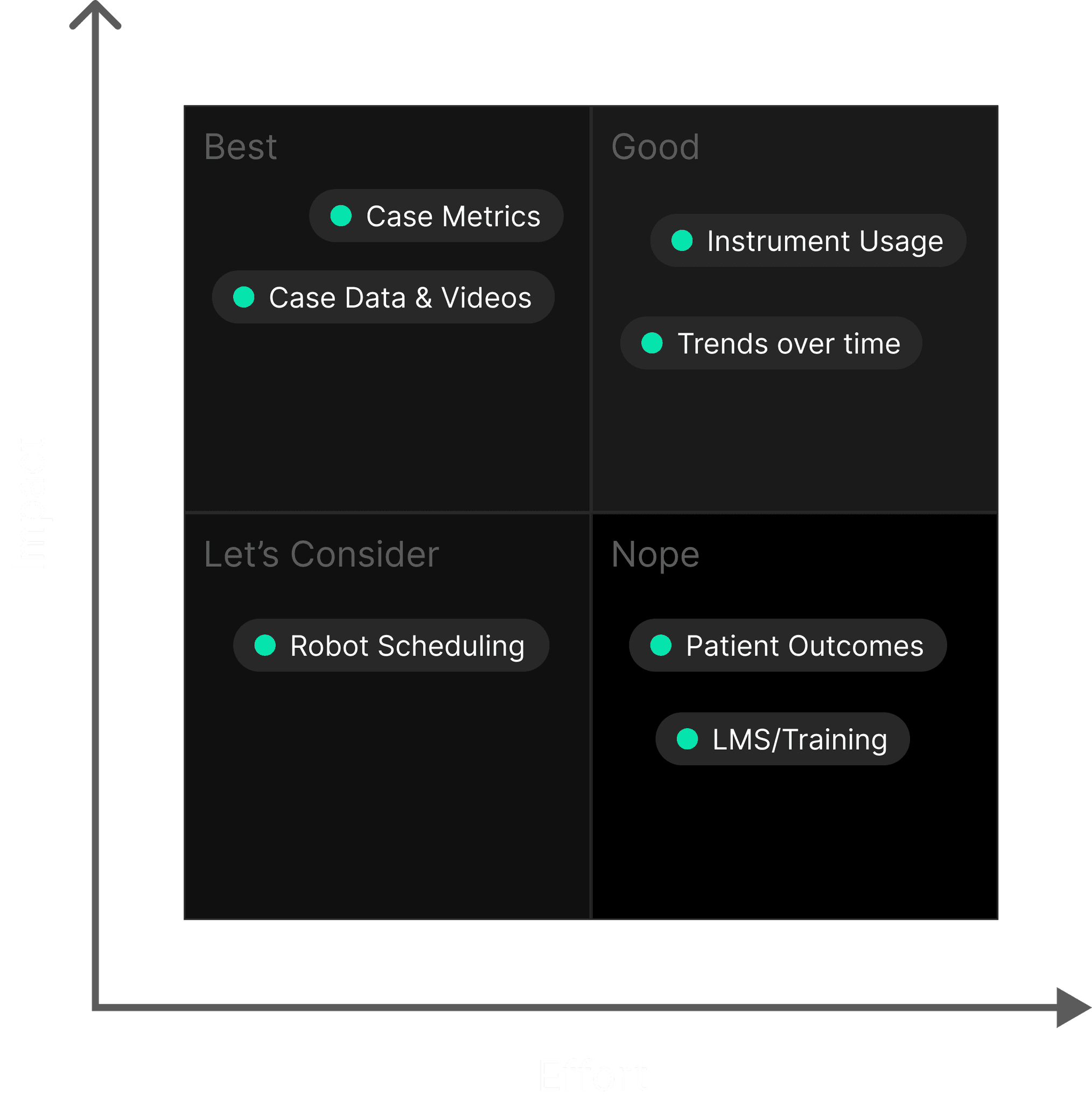
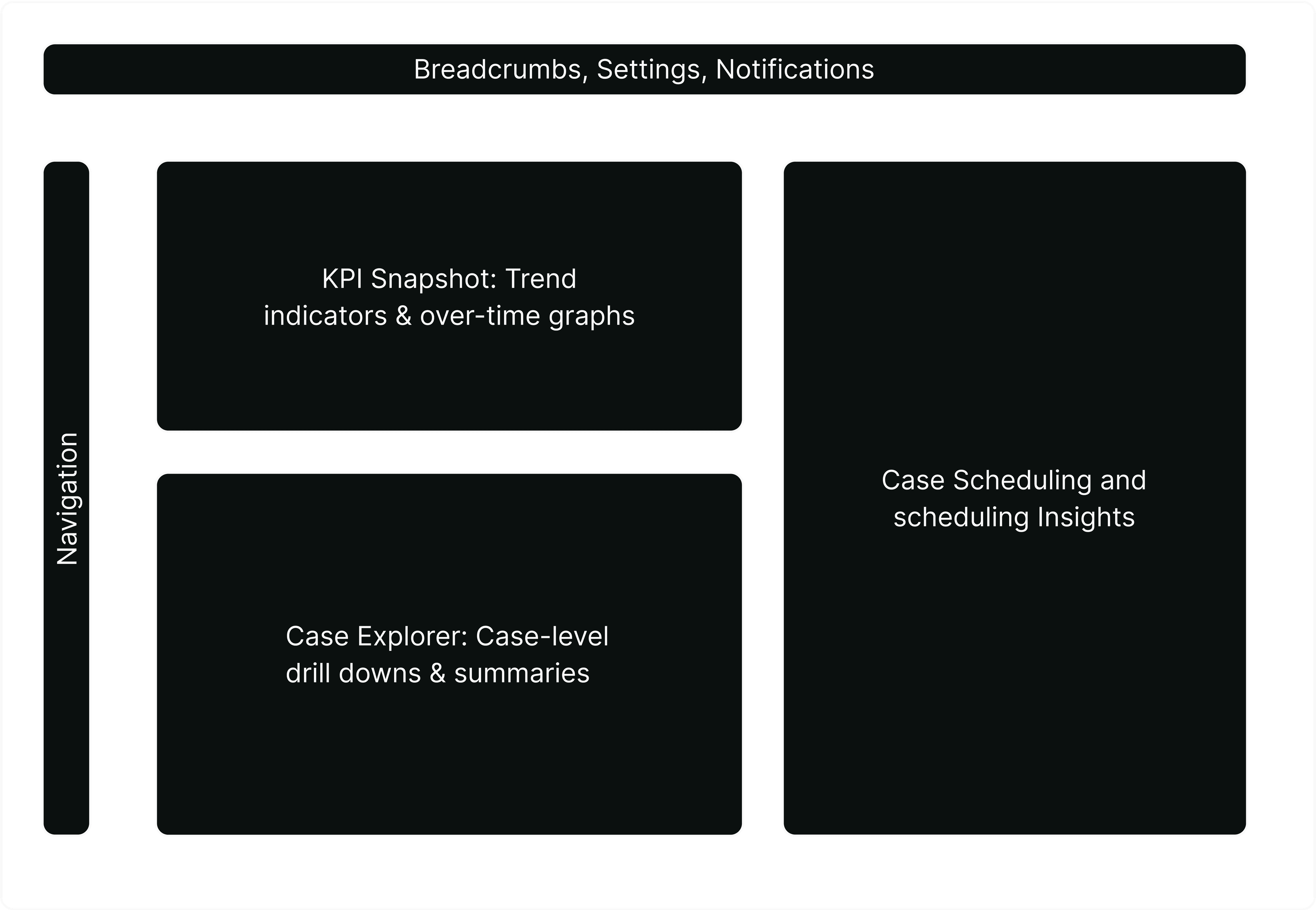
COMPONENTS OF RECENT CASES